Monday, 23 February 2015

Evaluation

                                    Evaluation 


At the start of the project I was very unsure and could have never guessed that I'd be making such concept art and got so much done. I started off unsure like everyone else in the class but I took advantage of what I saw and I was looking around for inspiration. I went to the library and looked at the art section let my eyes judge what stands out the most and I would then base my concept on that. 

As I went on with this thought, I saw many books about envirionments. They had real pictures of scenery and landscapes, hand drawn environments (paintings) etc. I had no interest in this for now but I did seriously consider doing environment concept art for my FMP because it would've made my portfolio of work and skills broader. 

Having talked to the teacher about it, we decided I should go with the one in which I can really begin to show my skills off and so I wanted to a character concept. In the games industry there would have been a brief already made for me by the client and I would have a story to work to, an art style, the way the client wants it drawn etc but because I was alone on this I did all that myself.

I think creating the story went really well for me because in the end of it I was able to create quite an interesting story (if I say so myself).

One of the problems I encountered while working on this project was to create a diverse number of pieces made by different painting and color styles. The problem was that I kept getting tied down on one way of drawing and I'd forget the other for example if I'm doing a quick pencil drawing of the characters that I chose in my research, I would forget to move onto other materials like acrylic paint and water paint or digital drawing. It took adjusting but I very quickly adapted to this  and I started creating multiple different pieces. 

In order to evaluate my work precisely I designed an online survey on the website 'surveymonkey.com' and gave it to people who had never seen my work before to criticise and give me feedback on it. 
I wanted honest reviews and feedback of my work so I added on the survey that ''Any criticism will be used and taken productively''                             


https://www.surveymonkey.com/r/X77XGYQ


Here are the questions I wrote in the survey:


1. What do you think of the work presented in the blog?


                                                           xxxxxx


2. What are the strong aspects of my art? What do you like about my work?

                                                           xxxxxx


3. What is good about the work presented to you?


                                                           xxxxxx


4. Would you say there is a wide variety of materials used (i.e paints, hand drawn, digital)?                                                             xxxxxx


5. Having seen my art and my work, what do you think I can improve on? Things you didn't like about my work? Any criticism will be used and taken productively


                                                           xxxxxx

6. If you think my art was good, please explain what you liked about it. If you see room for improvement and things that I could do differently, please let me know here:


                                                     xxxxxx


That is how the survey looks. I sent it out for people to fill in and give me feedback on my tasks 1 - 6 and now I will analyze these results.


This response is very thorough and detailed. It points out the strengths and the weaknesses of my work in detail. It talks about the technical quality, the production, the story and base of the project and it criticizes the work well.

For the first question my work is admired and said to be good for a young person as it portrays a unique story. 


The responses were positive when it came to the quality of my work. Comments like ''The work is of high quality'' and ''is presented in good artistic style'' say that my final production was good and to a professional standard. 

When talking about the art itself and the styles used and the variety of techniques, the feedback said that it was all well painted: ''it is well detailed, the perspective is dead on'' 
The feedback also says that I was successful in using different kinds of materials and so I was able to reach my goal of creating a diversity of different looking drawings by the end of the project.
I know that the reviewers say I met the objectives set for me before I started the work as the comments like ''It is well detailed'' and that my idea and final outcome had a ''singularity'' factor. 
One of the reviews criticised that it felt like I stayed away from my initial ideas in certain parts.
This teaches me and the way I take such comments is that I instantly create a goal for next time and how I can avoid making the same 'mistake' again. Next time I shall remember to focus on absolutely all aspects of my initial ideas as that is what the people want. 
The only criticism I got was that in future I should go for a different art style next time from the one used this time. Having given a graphic tablet from a good friend of mine, I can now create more work in my free time just to learn and improve on other drawing styles.


Presentation


Character: Eva
Story (Her Role): She is the woman the devil has a fling with that later creates the main character of the the game.
Before I did her outfit I wanted to focus mainly on the face so as a temporary top, I put on her the first thing that came to my mind which was an Egyptian Pharoah god shoulder cover.


This is how Eva looks in the story of the game and how she would look on the night she meets the devil. 
I changed her clothing according to the story so it all fits in.


Scene: Heaven/Paradise
Story(Role played in the story): This is one of the places the devil will go through as he proceeds making his way to the dimension where he fights 'good'/God.


Scene: hell
Story(Role played in the story): When being introduced separately as characters, the devil will be shown to live here as he prepares to go to war.


Character: God
Story (Role played in the Story): He will be shown floating in a completely white space. As one of my concepts showed in Task 5, he is standing with universes floating around him as he creates one with his hand, standing in a  blank space. He will fight the devil.


Character: Name Unknown

Story (Role played in the story): He is the son of the devil after he has a fling with Eva. This picture is where the character is in the city thinking about committing a crime. As the story says, he has a personality worse than the devil because he is filled with a lot of evil. This scene shows him sitting on a car with a gun in his hand and he is shown thinking. Before the devil finds out about him he is in this city. He steals, murders and robs in the city and this scene is of him getting ready to commit another crime before he meets the devil and unlocks his evil powers completely to fight against him.


Extra Asset

Scene: Paradise
Story(Role): A scene of paradise that the character God will be shown fighting in with the devil. 

A spar posture of the main character getting in a fight with someone in the city before he is found by the devil.


Production

 Production


As I proceeded making my art pieces and concepts, I took screenshots and here I will put the pictures and explain every frame:


This is the first draft profile I created for my character and I based him off of this as this is how an artist in the games industry would work mostly (to a brief).


                                                                        Protagonist


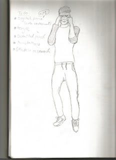
I did some primary research by taking a picture of myself in a posture that would be then used on the main character. I  went through basic drawing stages for this piece and start with a very basic stick drawing of where the limbs go and how the body's skeleton looks. I further developed on it and this is the production stage where I had made a sketch and I went on to Photoshop to recreate it in color as a final concept (Task 6)


After having got the initial sketch of my concept and the first profile draft, I tweaked the information ever so slightly and made the piece above. I now started to use water color to give an aspect of diversity within the materials used for my work.

 In the planning of this project at the ideas generation stage I decided to use multiple forms of painting and drawing so I am not stuck with a narrow set of concept pieces made out of strictly one material like a pencil or just pen etc. 
I started to develop further on my character and looked back at the story to see what I am working from. The character is young and lives in city area meaning his clothing would be quite upto date with the modern fashion.
I used water painting to create 3 full sets of clothing. 


At this stage I started making concepts of the character in different outfits that I had created and I wanted to pick one that seems to best fit him/ look good. Usually, I believe the project leader would look at these concepts and pick the one he/she likes if any. But because I had to take charge of that role myself after creating the base story myself, I also made the decision on what I thought looked best on the character. 


Upscaled concept done in water color and painting with shading done by different layers of water color.

Here I started a very quick sketch of the body , an outline.

I went over the first draft sketch and with a clearer outlining, I started to color him in. 


I started to work on the character in detail now and gave him a weapon that was previously shown in one of my concepts. I painted in the body and decided to make a very quick and basic background which purpose was solely to give a perspective to the character's body.
As an extra, if I had time I could start working on a poster for the game. I went in stages from a completely blank black and white sketch to adding more detail. 


Evil (The Devil as we see him)


After having done extensive research on this character, I decided to experiment with different styles rather than going with strictly one where the devil is constantly just one form.

This is a concept I drew where I made him an aged character in casual clothing. With horns protruding from his head, the posture he is stood in and the casual cig in his hand, this gave him an evil look. I added detail to the clothing , his shadow and a little bit on the small bit of environment behind him.


The second concept I drew was inspired by the cartoony type with the red skin and wings however instead of the cartoon look, I went for a different approach. To give this version a sinister look that fits in well with the story, I decided to give him a throne of skulls that would look fitting in Hell. This concept could be used for the scenes where the devil is shown to have his throne in Hell. Going further into the design, I gave him a weapon in his hand that gives him the ready to attack look. 


This is almost finished stage of one of the 
characters. 

This is the finished piece of the devil character after all the research and production. Realistically, a humanoid creature would look weird if it did not have genitals (being male at least) so I created a quick concept of the devil here with genitals but also with his body laid out so all the features can be seen. I also gave him two weapons of choice and given the amount I create, the project leader would choose which ones they like and would want me to further focus on. As I had that role, I chose the sword, thus creating the scene where he is sat on a  throne with a sword.
This was  an idea I had for a poster that I could work on if I got time to spare after all other work being done.


As I drew he draft of this idea,  I had another idea which was to make the devil a purple shade with a dark tint to his skin and not he cliche red skin.


                                                       God

     
Phase 1 - quick sketch of the body 


Phase 2 - I go over the previous layer and created a better defined outline of the face and body.


This is how I started to form my God character. I started with a very quick draft, improved it  further and then added features to it on the 3rd improvement before finally making the quick concept.


Here, the God character is floating in a blank  space beyond time and space and he is seen creating a universe  under his hand. 


These are the ideas I had as quick mindstorm sketches of a scene for the main character. I drew 4 with different positions and finally picked one at the end as seen there, under the other sketches.


I focused on the logo here and decided to improve it


By zooming in close, I was able to use the Bamboo to work on the rings, I started to rub out the extra paint.

I added more shade into the logo now to give it a good look when zoomed out (Finished product on Task 6) 


Quick fixes to layers going on top of each other so the colors work perfectly when all layers are made visible. 

I started  by marking the area where the car logo saying 'sport' would go

I painted in the words  and rubbed out the box that was a guidance for me to draw inside of.


Just like the logo of the car, I added shading and a bit of shine to the sport badge at the side.

Redefining the 'R8' Badge on the left side.


Here I started to straighten out the rear bumper so its lined up and straight.


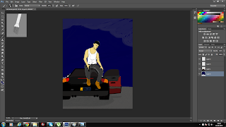
I was requested by people who had seen me working on this to add more detail in the background of my character (being the car at this point)  and here is how I took the criticisms and suggestions. I went in detail on the car and as i show above, I took the drawing for a quick sketch concept to a further more detailed, better looking concept. 


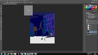
Here I started to draw the background (city) the scene where the character sits before he commits a crime. 


Phase 2 of drawing the background


I drew a basic out line for where the character and the car is and parts where the road and the art on the upper layer blocks and covers the background I am drawing. I carried on working in the background and added an acrylic look to the painting. 


After finishing the car and detail on the vehicle and player, I started to create a quick acrylic looking painting for the background.
The stages of me creating a heaven/paradise environment.


All work that is in production here is shown as finished  pieces on the next task.